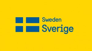
The Swedish government unveiled the new face of “brand Sweden” on Tuesday, a project that was one year in the making and includes a new font, a flag, and classic Swedish minimalism.
Flag, language, and text are the three elements of Sweden’s new brand identity. The new brand is a Swedish flag accompanied by the word “Sverige” (Sweden in Swedish) in the new “Sweden Sans” font type, also designed exclusively for the project. On international websites the local word for Sweden will also be displayed in smaller text above Sverige.
“We worked for about two months trying out every possible angle to find something creative and new that would connect to Sweden,” Mattias Svensson, Creative Director at design agency Söderhavet, told The Local. “And we just kept coming back to the flag. The flag is a good anchor for the rest of the identity.”
Featuring the exact colours and dimensions as in the 1600s, the brand flag “reinstates the Swedish flag as the country’s primary identity bearer,” Söderhavet’s website wrote.
“When I pitched the flag concept, the brand manager said, ‘A designer who comes up with a suggestion like this is either the world’s most lazy designer, or a genius,'” Svensson told The Local. “It’s audacious to choose such an obvious symbol as the foundation for an identity, but I’m proud we did so — the flag will be just as relevant 20 years from now as it is today. ”
The old design, left, with Tuesday’s new look, right.
Stockholm-based design agency Söderhavet created the new brand, which was commissioned by the Council for the Promotion of Sweden (‘Nämnden för Sverigefrämjande i Utlandet’, NSU), which operates the country’s official online information gateway Sweden.se.
The NSU is made up of five separate agencies aiming to promote Sweden abroad – the Ministry of Foreign Affairs; Visit Sweden; the Ministry for Enterprise, Energy and Communications; Business Sweden; and the Swedish Institute. The new brand identity will be used by all five websites when communicating on behalf of Sweden, as well as in printed materials.
“We already had that communications platform, so the next step was to have that joint visual identity,” Frida Roberts, Head of Communications at the Swedish Institute, told The Local, adding that the concept and identity aspects of the project, not including technological implementation, cost about 400,000 kronor ($61,380).
Since the flag is admittedly quite a generic symbol, Svensson said they realized they needed something unique to accompany the flag. That’s when the “Sweden Sans” font was born.
“First our design director looked at fonts that would go with the Scandinavian tradition of minimalism. We couldn’t find something that was exactly what we wanted. So we drew our own.”
The new brand focuses on the shape and colours of the Swedish flag itself. By including the Swedish word for Sweden as well as a local translation of the name, “an emphasis on Sweden’s distinct linguistic heritage is balanced by the country’s well-known tradition of openness to the world and respect for other cultures.”
Several of Sweden’s leading design agencies applied to design the new brand in a public procurement contest, and Söderhavet was chosen after a final anonymous judging round with four other agencies. The jury consisted of NSU members.
Svensson said the agency is very satisfied with their work and they look forward to similar assignments in the future.
“It was difficult, but fun. We would love to do more nation-branding in the future. Maybe Germany, China, Japan…we have learned a lot.”
Solveig Rundquist
Source: The Local Sweden

