

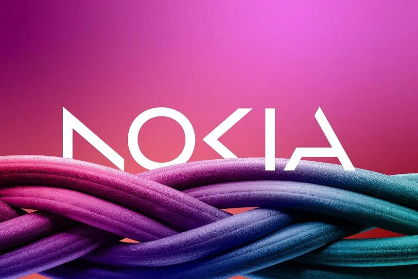
Nokia, the Finnish 5G equipment maker, has redone its logo to stop people from associating it with mobile phones – a business the company left several years ago.
The new logo consists of five different shapes forming the name Nokia. The iconic blue color of the old logo has been replaced with a range of colors depending on the use.
The brands new logo, revealed on Sunday, comes alongside a set of new strategic goals.
“We want to launch a new brand that is focusing on network and industrial digitalization. This is completely different from being a mobile phone brand,” chief executive Pekka Lundmark said in an interview on Sunday, ahead of the Mobile World Congress in Barcelona.
The strategy has been helped by restrictions on the Chinese rival Huawei. A number of European governments have blocked Huawei from selling parts for 5G networks.
Nokia also wants to increase growth in its business selling private 5G networks to companies.
“We are not happy yet with where we are,” Lundmark said during the interview.
Source: bloomberg.com


[…] References:https://scandasia.com/nokia-redesigns-iconic-logo-to-visualize-strategy-shift/ […]
[…] References:https://scandasia.com/nokia-redesigns-iconic-logo-to-visualize-strategy-shift/ […]