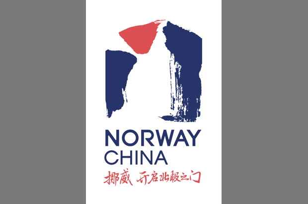
ScandAsia can share the Norway China logo, which is simply the new logo for the three Norwegian missions in China (Beijing, Guangzhou and Shanghai) together with Innovation Norway and the Norwegian Seafood Council in China to have a new, shared visual identity.

The logo symbolises that Norway leads the way to the Arctic. Norway means the way to the North – the road to the High North, which is the explanation for the core concept of the new symbol.
The form of the logo is originated from the Chinese character of gate – men, 门. From that open door you can see the Norwegian landscape – of cliffs, waterfalls, white snow, icebergs, mountains and rocks. Nature and energy. Powered by nature, Norway is an Arctic nation in terms of science, environment, tourism, business, culture, education and in our foreign policy outlook. Look to the North.
Now you will know what this Norway China logo is about when you come across it; in connection to Royal Norwegian Embassy in Beijing, the Consulate General in Shanghai, the Consulate General in Guangzhou or any of the other entities. And it should be noted that Norway recognised China later than the other Nordic countries, so this logo is not intended to highlight any diplomatic relations anniversary.

